#clickable link
df <- data.frame(
  Name = c("Kaggle", "Github"),
  Link = c('<a href ="https://www.kaggle.com/datasets/wasiqaliyasir/breast-cancer-dataset" target ="_blank">Click</a>',
           '<a href ="https://github.com/jianyuan941/Breast-Cancer-Dataset" target= "_blank">Click</a>')
)
kable(df, escape = F)Breast-Cancer-Dataset
0.1 Introduction
This project aims to perform exploratory data analysis(EDA) on Breast Cancer Dataset and develop a predictive model using the Random Forest algorithm.
The dataset, accessible via the clickable link below, is specifically designed to facilitate the development of predictive models for breast cancer diagnosis. It originates from the Breast Cancer Wisconsin (Diagnostic) Data Set, which is widely used as benchmark in machine learning applications for medical diagnosis.
#overview of data
sql_function(
"select
  *
from
  Breast_cancer_dataset"
) %>%
  str()
'data.frame': 569 obs. of 32 variables:
$ id : int 842302 842517 84300903 84348301 84358402 843786 844359 84458202 844981 84501001 ...
$ diagnosis : chr "M" "M" "M" "M" ...
$ radius_mean : num 18 20.6 19.7 11.4 20.3 ...
$ texture_mean : num 10.4 17.8 21.2 20.4 14.3 ...
$ perimeter_mean : num 122.8 132.9 130 77.6 135.1 ...
$ area_mean : num 1001 1326 1203 386 1297 ...
$ smoothness_mean : num 0.1184 0.0847 0.1096 0.1425 0.1003 ...
$ compactness_mean : num 0.2776 0.0786 0.1599 0.2839 0.1328 ...
$ concavity_mean : num 0.3001 0.0869 0.1974 0.2414 0.198 ...
$ concave.points_mean : num 0.1471 0.0702 0.1279 0.1052 0.1043 ...
$ symmetry_mean : num 0.242 0.181 0.207 0.26 0.181 ...
$ fractal_dimension_mean : num 0.0787 0.0567 0.06 0.0974 0.0588 ...
$ radius_se : num 1.095 0.543 0.746 0.496 0.757 ...
$ texture_se : num 0.905 0.734 0.787 1.156 0.781 ...
$ perimeter_se : num 8.59 3.4 4.58 3.44 5.44 ...
$ area_se : num 153.4 74.1 94 27.2 94.4 ...
$ smoothness_se : num 0.0064 0.00522 0.00615 0.00911 0.01149 ...
$ compactness_se : num 0.049 0.0131 0.0401 0.0746 0.0246 ...
$ concavity_se : num 0.0537 0.0186 0.0383 0.0566 0.0569 ...
$ concave.points_se : num 0.0159 0.0134 0.0206 0.0187 0.0188 ...
$ symmetry_se : num 0.03 0.0139 0.0225 0.0596 0.0176 ...
$ fractal_dimension_se : num 0.00619 0.00353 0.00457 0.00921 0.00511 ...
$ radius_worst : num 25.4 25 23.6 14.9 22.5 ...
$ texture_worst : num 17.3 23.4 25.5 26.5 16.7 ...
$ perimeter_worst : num 184.6 158.8 152.5 98.9 152.2 ...
$ area_worst : num 2019 1956 1709 568 1575 ...
$ smoothness_worst : num 0.162 0.124 0.144 0.21 0.137 ...
$ compactness_worst : num 0.666 0.187 0.424 0.866 0.205 ...
$ concavity_worst : num 0.712 0.242 0.45 0.687 0.4 ...
$ concave.points_worst : num 0.265 0.186 0.243 0.258 0.163 ...
$ symmetry_worst : num 0.46 0.275 0.361 0.664 0.236 ...
$ fractal_dimension_worst: num 0.1189 0.089 0.0876 0.173 0.0768 ...0.2 Overview Relationship Between Variables
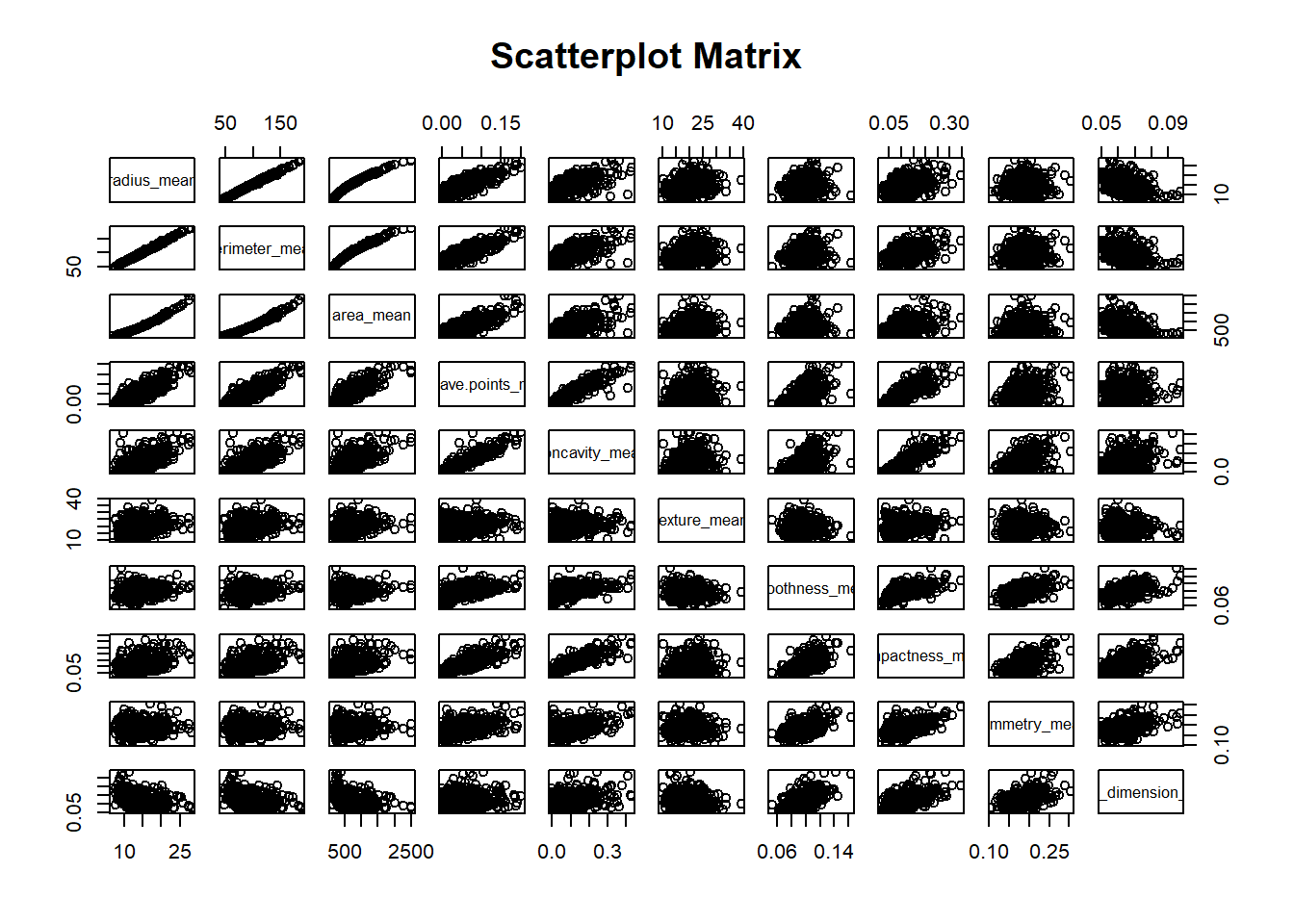
0.2.1 Scatterplot Matrix
0.2.2 Correlation between Variables
#calculation

breast_cancer_df <- Breast_cancer_dataset[,3:12]
pca_function(
  database = breast_cancer_df,
  name = "breast_pca")
Importance of components:
PC1 PC2 PC3 PC4 PC5 PC6 PC7
Standard deviation 2.3406 1.5870 0.93841 0.7064 0.61036 0.35234 0.28299
Proportion of Variance 0.5479 0.2519 0.08806 0.0499 0.03725 0.01241 0.00801
Cumulative Proportion 0.5479 0.7997 0.88779 0.9377 0.97495 0.98736 0.99537
PC8 PC9 PC10
Standard deviation 0.18679 0.10552 0.01680
Proportion of Variance 0.00349 0.00111 0.00003
Cumulative Proportion 0.99886 0.99997 1.00000att <- rownames(breast_pca_loading)#Correlation review between variables
pca_function(
att_for_correlation = att,
database = breast_cancer_df,
name = "breast_pca")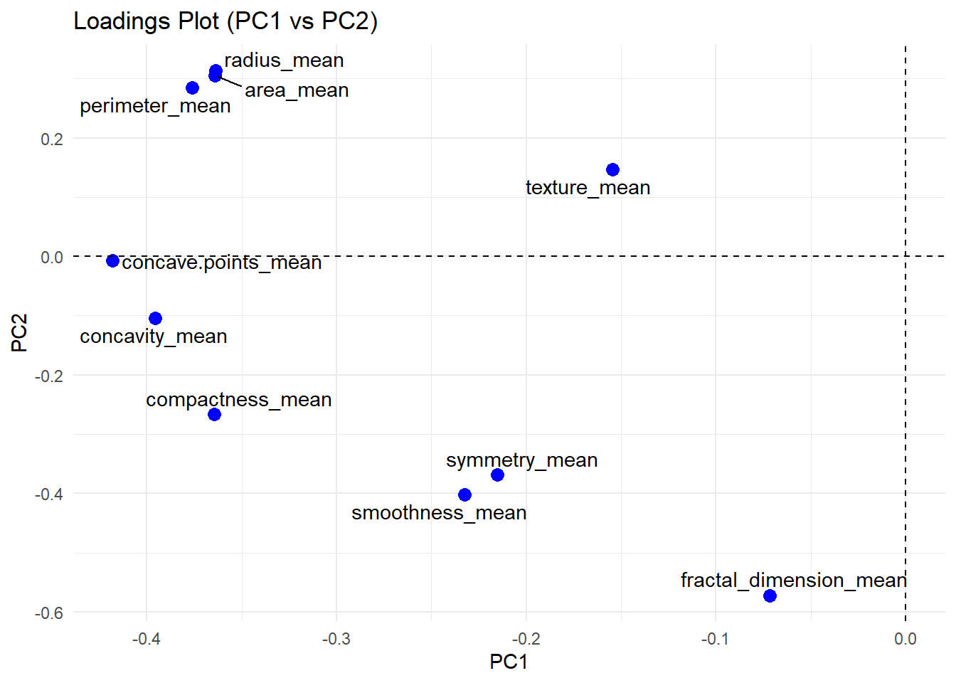
0.2.3 Interpretation Scatterplot and Loading Plot
The Scatterplot Matrix illustrates the pairwise relationship between variables along the axis. Some variables shows strong positive correlations (e.g., perimeter, area and radius), while others exhibit negative correlations (e.g., perimeter and fractal dimension). These correlation patterns are further simplified in the PCA loading plot. Variables that are strongly correlated tend to cluster together (e.g., perimeter, area and radius), whereas uncorrelated variables are positioned farther apart.
0.3 Score Plot
0.3.1 Proportion of Variance
summary(breast_pca)Importance of components:
PC1 PC2 PC3 PC4 PC5 PC6 PC7
Standard deviation 2.3406 1.5870 0.93841 0.7064 0.61036 0.35234 0.28299
Proportion of Variance 0.5479 0.2519 0.08806 0.0499 0.03725 0.01241 0.00801
Cumulative Proportion 0.5479 0.7997 0.88779 0.9377 0.97495 0.98736 0.99537
PC8 PC9 PC10
Standard deviation 0.18679 0.10552 0.01680
Proportion of Variance 0.00349 0.00111 0.00003
Cumulative Proportion 0.99886 0.99997 1.00000Score will be assigned to values based on principal component 1 (PC1) on the x-axis and principal component 2 (PC2) on the y-axis. The combination of both PC1 and PC2 explain 79.97 % of the total variance in the dataset.
0.3.2 Overview of Compotents in PC1 and PC2
pca_rule <- breast_pca_loading[,1:2]
pca_rule %>%  result_displayv2(.,5,"")
The table above shows loadings of each variable on the principal components. Variable with higher loading yields bigger influence to the total score of sample. For example, concave_point_mean has the highest loading in PC1 (-0.41). which indicates that concave_point_mean play the most important role in distinguish samples in PC1. This idea applies to the following PCs.
0.3.3 Scatterplot of Sample’s Score
breast_pca_for_plot <- breast_pca_score[,1:3]
breast_pca_for_plot$att <- Breast_cancer_dataset$diagnosis

plot_ly(breast_pca_for_plot,
        x = ~PC1, y = ~PC2,
        color = ~att,
        colors = c("red", "blue"),
        type = "scatter",
        mode = "markers")
The scatterplot above shows the distribution of samples based on total score. The combination of scores obtained from PC1 and PC2 forms standard two-dimensional graph. Scores from PC1 influence the coordination of sample along x-axis, whereas PC2 influences the coordination along y-axis. As a result, samples with similar characteristics cluster together.
Applying color based on category further distinguishes the samples. Malignant tumors (M) tend to score higher, in contrast, benign tumors (B) generally exhibit lower scores.
0.4 Radius Analysis
0.4.1 Calculation of Mean Radius
#DESCRIPTIVE ANALYSIS - RADIUS_MEAN
  filter_to_generate_new_db(
  database = Breast_cancer_dataset,
  filter_col = diagnosis
) %>%
des_analysis_dataframev2(
  f = radius_mean,
  group = diagnosis,
  #NEW BRANCHES
  included_new_db = "Radius_Distribution_group_by_diagnosis",
  return = NULL,
  sorting = T
) %>%
  #DIFFERENCES OF M AND B BASE ON MEAN_RADIUS
    select(-radius_mean) %>%
    distinct() %>%
    #NEW BRANCHES
    save_function(name= "Summary_Radius_mean_by_group", type = "NULL", return = T, get_mean_sd = T, assign_name = "radius_mean") %>%
    t(.) %>%
    kbl(caption = "Descriptive Analysis for Mean Radius") %>%
kable_styling()| diagnosis | M | B |
| ∑x | 3702.120 | 4336.309 |
| ∑n | 212 | 357 |
| mean | 17.46283 | 12.14652 |
| median | 17.325 | 12.200 |
| var | 10.265431 | 3.170222 |
| sd | 3.203971 | 1.780512 |
| range | 10.95 : 28.11 | 6.981 : 17.85 |
| x(68%) | 151 | 244 |
| x(95%) | 204 | 342 |
| x(99%) | 209 | 356 |
| 99%+ | 3 | 1 |
#===Preparation for Graph===
# Data for Histogram
benign <- Breast_cancer_dataset_categoried_by_diagnosis_B %>% pull(radius_mean)
malignant <- Breast_cancer_dataset_categoried_by_diagnosis_M %>% pull(radius_mean)

# Data for Bell Curve
number_of_observation <- nrow(Breast_cancer_dataset)
bell_curve_generator(name = "B", mu = radius_mean_mean_B, sigma = radius_mean_sd_B,sample_size = number_of_observation)
bell_curve_generator(name = "M", mu = radius_mean_mean_M, sigma = radius_mean_sd_M,sample_size = number_of_observation)


# Plot histograms + curves
radius_mean_plot<- plot_ly() %>%
  hist_plotly(x= benign, x_bell_curve = B_x, y_bell_curve = B_y, legendgroup = "Benign radius") %>%
  hist_plotly(x= malignant, x_bell_curve = M_x, y_bell_curve =  M_y, color = "red",legendgroup = "Malignant radius") %>%
  layout(barmode = "overlay",
         title = "Histogram + Bell Curves by Category",
         xaxis = list(title = "Radius"),
         yaxis = list(title = "Density"))
0.4.2 Calculation of Worst Radius
| diagnosis | M | B |
| ∑x | 4480.580 | 4776.589 |
| ∑n | 212 | 357 |
| mean | 21.13481 | 13.37980 |
| median | 20.59 | 13.35 |
| var | 18.348967 | 3.925817 |
| sd | 4.283569 | 1.981368 |
| range | 12.84 : 36.04 | 7.93 : 19.82 |
| x(68%) | 146 | 238 |
| x(95%) | 202 | 343 |
| x(99%) | 211 | 356 |
| 99%+ | 1 | 1 |
0.4.3 Subplot of Mean Radius and Worst Radius by Severity
# Combine subplots
subplot(radius_mean_plot, radius_worst_plot, nrows = 2, shareX = TRUE, shareY = TRUE) %>%
  layout(title = "")
0.4.4 Interpretation of Radius Subplot
The graph shows the distribution of mean radius and worst radius grouped by tumor severity. Malignant tumors have a mean radius ranging from 10.95 to 28.11 (mean: 17.46, sd: 3.20) and a worst radius from 12.84 to 36.04 (mean: 21.13, sd: 4.28). Most malignant tumors fall within one standard deviation of the mean (≈71% for mean radius, ≈69% for worst radius), with fewer samples between one and two standard deviations (≈24% and ≈26%, respectively) and very few beyond two standard deviations. Mean radius is more tightly clustered, while worst radius shows a broader spread. Benign tumors have smaller measurements, with mean radius ranging from 6.98 to 17.85 (mean: 12.14, sd: 1.78) and worst radius from 7.93 to 19.82 (mean: 13.38, sd: 1.98). Most benign tumors also fall within one standard deviation (≈68% for mean radius, ≈67% for worst radius), with a moderate number between one and two standard deviations and very few beyond that. Overall, benign tumors are generally tightly clustered, but because the radii of benign and malignant tumors overlap considerably, radius alone cannot reliably distinguish tumor severity.
0.5 Perimeter Analysis
0.5.1 Calculation of Mean Perimeter
Breast_cancer_dataset %>%
  des_analysis_dataframev2(
    f = perimeter_mean,
    group = diagnosis,
    included_new_db = "Perimeter_mean_db_group_by_diagnosis",
    return = T,
    sorting = T
  ) %>%
  select(-perimeter_mean) %>%
  distinct() %>%
  save_function(name ="Perimeter_mean", type = "NULL", return = T, get_mean_sd = T, assign_name ="mean_perimeter") %>%
  t(.) %>%
  kbl(caption ="Mean Perimeter Summary") %>%
kable_styling()| diagnosis | M | B |
| ∑x | 24457.46 | 27872.92 |
| ∑n | 212 | 357 |
| mean | 115.36538 | 78.07541 |
| median | 114.20 | 78.18 |
| var | 477.6259 | 139.4156 |
| sd | 21.85465 | 11.80744 |
| range | 71.9 : 188.5 | 43.79 : 114.6 |
| x(68%) | 153 | 249 |
| x(95%) | 205 | 340 |
| x(99%) | 209 | 356 |
| 99%+ | 3 | 1 |
#Data prepartion for plotting
benign_perimeter_mean <- Breast_cancer_dataset_categoried_by_diagnosis_B %>% pull(perimeter_mean)
malignant_perimeter_mean <- Breast_cancer_dataset_categoried_by_diagnosis_M %>% pull(perimeter_mean)
bell_curve_generator(name = "Mean_Perimeter_B", mu = mean_perimeter_mean_B, sigma = mean_perimeter_sd_B, sample_size = number_of_observation)
bell_curve_generator(name = "Mean_Perimeter_M", mu = mean_perimeter_mean_M, sigma = mean_perimeter_sd_M, sample_size = number_of_observation)


#plotting
perimeter_mean_plot <- plot_ly() %>%
  hist_plotly(x = benign_perimeter_mean, x_bell_curve = Mean_Perimeter_B_x, y = Mean_Perimeter_B_y, legendgroup = "benign perimeter")%>%
  hist_plotly(x = malignant_perimeter_mean, x_bell_curve = Mean_Perimeter_M_x, y = Mean_Perimeter_M_y, color = "red", legendgroup = "malignant perimeter") %>%
  layout(barmode = "overlay",
         title = "Histogram + Bell Curves by Category",
         xaxis = list(title = "Perimeter"),
         yaxis = list(title = "Density"))
0.5.2 Calculation of Worst Perimeter
Breast_cancer_dataset %>%
  des_analysis_dataframev2(
    f = perimeter_worst,
    group = diagnosis,
    return = T,
    sorting = T
  ) %>%
  select(-perimeter_worst) %>%
  distinct() %>%
  save_function(name = "worst_perimeter_db_group_by_diagnosis", type = "NULL", get_mean_sd = T, assign_name = "worst_perimeter", return = T) %>%
  t(.) %>%
  kbl(caption = "Descriptive Analysis for Worst Perimeter") %>%
kable_styling()| diagnosis | M | B |
| ∑x | 29970.51 | 31061.12 |
| ∑n | 212 | 357 |
| mean | 141.37033 | 87.00594 |
| median | 138.00 | 86.92 |
| var | 867.7181 | 182.9822 |
| sd | 29.45706 | 13.52709 |
| range | 85.1 : 251.2 | 50.41 : 127.1 |
| x(68%) | 148 | 237 |
| x(95%) | 202 | 339 |
| x(99%) | 211 | 357 |
| 99%+ | 1 | 0 |
#===Preparation for plotting===
benign_worst_perimeter <- Breast_cancer_dataset_categoried_by_diagnosis_B %>% pull(perimeter_worst)
bell_curve_generator(name = "benign_worst_perimeter", mu =worst_perimeter_mean_B, sigma = worst_perimeter_sd_B, sample_size = number_of_observation)
malignant_worst_perimeter <- Breast_cancer_dataset_categoried_by_diagnosis_M %>% pull(perimeter_worst)
bell_curve_generator(name = "malignant_worst_perimeter", mu = worst_perimeter_mean_M, sigma = worst_perimeter_sd_M, sample_size = number_of_observation)


#===Plotting===
worst_perimeter_plot <- plot_ly() %>%
  hist_plotly(x= benign_worst_perimeter, x_bell_curve = benign_worst_perimeter_x, y_bell_curve = benign_worst_perimeter_y, legendgroup = "benign perimeter") %>%
  hist_plotly(x= malignant_worst_perimeter, x_bell_curve = malignant_worst_perimeter_x, y_bell_curve = malignant_worst_perimeter_y, color = "red", legendgroup = "malignant perimeter") %>%
  layout(barmode = "overlay",
         title = "Histogram + Bell Curves by Category",
         xaxis = list(title = "Perimeter"),
         yaxis = list(title = "Density"))
0.5.3 Subplot of Mean Perimeter and Worst Perimeter by Severity
# Combine subplots
subplot(perimeter_mean_plot, worst_perimeter_plot, nrows = 2, shareX = TRUE, shareY = TRUE) %>%
  layout(title = "")
0.5.4 Interpretation of Perimeter Subplot
The perimeter of a breast tumor refers to the measured outer boundary length of a tumor cell nucleus in digitized biopsy images. In the dataset, both mean and worst perimeter values of benign tumors are generally lower and more tightly clustered compared to malignant tumors. Benign tumors have a mean perimeter ranging from 43.79 to 114.6 (mean: 78.08, sd: 11.81), with most samples (≈70%) within one standard deviation, 25% between one and two standard deviations, and only ≈5% beyond two standard deviations. Malignant tumors have a mean perimeter ranging from 71.9 to 188.5 (mean: 115.37, sd: 21.85), with similar proportions within each range. For worst perimeter, benign tumors range from 50.41 to 127.1 (mean: 87.01, sd: 13.53) and malignant tumors from 85.1 to 251.2 (mean: 141.37, sd: 29.46), showing that malignant perimeters are higher and more dispersed, while benign perimeters remain more concentrated.
0.6 Texture Analysis
0.6.1 Calculation of Mean Texture
Breast_cancer_dataset %>%
  des_analysis_dataframev2(
    f=texture_mean,
    group = diagnosis,
    return = T,
    sorting = T
  ) %>%
  select(-texture_mean) %>%
  distinct() %>%
  save_function(name = "summary_mean_texture_by_diagnosis", type = "NULL", return = T, assign_name = "mean_texture", get_mean_sd = T) %>%
  t(.) %>%
  kbl() %>%
kable_styling()| diagnosis | M | B |
| ∑x | 4580.24 | 6395.57 |
| ∑n | 212 | 357 |
| mean | 21.60491 | 17.91476 |
| median | 21.46 | 17.39 |
| var | 14.28439 | 15.96102 |
| sd | 3.779470 | 3.995125 |
| range | 10.38 : 39.28 | 9.71 : 33.81 |
| x(68%) | 156 | 261 |
| x(95%) | 203 | 338 |
| x(99%) | 210 | 354 |
| 99%+ | 2 | 3 |
#===Data Preparation for plotting===
benign_mean_texture <- Breast_cancer_dataset_categoried_by_diagnosis_B %>% pull(texture_mean)
bell_curve_generator(name = "benign_mean_texture", mu = mean_texture_mean_B, sigma = mean_texture_sd_B, sample_size = number_of_observation)
malignant_mean_texture <- Breast_cancer_dataset_categoried_by_diagnosis_M %>%
pull(texture_mean)
bell_curve_generator(name = "malignant_mean_texture", mu = mean_texture_mean_M, sigma = mean_texture_sd_M, sample_size = number_of_observation)

#===Plotting===
mean_texture_plot <- plot_ly() %>%
  hist_plotly(x = benign_mean_texture, x_bell_curve = benign_mean_texture_x, y_bell_curve = benign_mean_texture_y, legendgroup = "benign texture") %>%
  hist_plotly(x = malignant_mean_texture, x_bell_curve = malignant_mean_texture_x,
              y_bell_curve = malignant_mean_texture_y, color = "red", legendgroup = "malignant texture") %>%
  layout(
    barmode = "overlay",
    title = "Texture Graph by Severity",
    xaxis = list(title = "Texture"),
    yaxis = list(title = "Density")
  )
0.6.2 Calculation of Worst Texture
Breast_cancer_dataset %>%
  des_analysis_dataframev2(
    f = texture_worst,
    group = diagnosis,
    return = T,
    sorting = T
  ) %>%
  select(-texture_worst) %>%
  distinct() %>%
  save_function(name = "summary_worst_texture_group_by_diagnosis", type = "NULL", assign_name = "worst_texture", return = T, get_mean_sd = T) %>%
  t(.) %>%
  kbl() %>%
kable_styling()| diagnosis | M | B |
| ∑x | 6215.46 | 8394.88 |
| ∑n | 212 | 357 |
| mean | 29.31821 | 23.51507 |
| median | 28.945 | 22.820 |
| var | 29.53710 | 30.18354 |
| sd | 5.434804 | 5.493955 |
| range | 16.67 : 49.54 | 12.02 : 41.78 |
| x(68%) | 158 | 246 |
| x(95%) | 201 | 339 |
| x(99%) | 210 | 354 |
| 99%+ | 2 | 3 |
#===Data Preparation for Plotting===
benign_worst_texture <- Breast_cancer_dataset_categoried_by_diagnosis_B %>% pull(texture_worst)
malignant_worst_texture <- Breast_cancer_dataset_categoried_by_diagnosis_M %>% pull(texture_worst)
bell_curve_generator(name = "benign_worst_texture", mu = worst_texture_mean_B, sigma = worst_texture_sd_B, sample_size = number_of_observation)
bell_curve_generator(name = "malignant_worst_texture", mu = worst_texture_mean_M, sigma = worst_texture_sd_M, sample_size = number_of_observation)

#===Plotting===
worst_texture_plot <- plot_ly() %>%
  hist_plotly(x = benign_worst_texture, x_bell_curve = benign_worst_texture_x, y_bell_curve = benign_worst_texture_y, legendgroup = "benign texture") %>%
  hist_plotly(x = malignant_worst_texture, x_bell_curve = malignant_worst_texture_x, y_bell_curve = malignant_worst_texture_y, color = "red", legendgroup = "malignant texture") %>%
  layout(
    barmode = "overlay")
0.6.3 Subplot of Mean Texture and Worst Texture by Severity
subplot(mean_texture_plot, worst_texture_plot, nrows = 2, shareX = T, shareY = T) %>%
  layout(title = "",
         xaxis = list(title = "Texture"),
         yaxis = list(title = "Density"))
0.6.4 Interpretation of Texture Subplot
Texture measures the variation in pixel brightness across the nucleus, with smoother nuclei having lower values and more irregular nuclei having higher values. The graph indicates that benign tumors generally have smoother nuclei compared to malignant tumors, although there is considerable overlap between the two groups. Benign tumors have a mean texture ranging from 9.71 to 33.81 (mean: 17.91, sd: 3.99), with ≈73% of samples within one standard deviation, ≈22% between one and two standard deviations, and ≈5% beyond two standard deviations. Malignant tumors have a mean texture ranging from 10.38 to 39.28 (mean: 21.60, sd: 3.78), with similar proportions. For worst texture, benign tumors range from 12.02 to 41.78 (mean: 23.52, sd: 5.49) and malignant tumors from 16.67 to 49.54 (mean: 29.32, sd: 5.43), showing that malignant nuclei tend to be rougher and more variable, while benign nuclei are generally smoother.
0.7 Area Analysis
0.7.1 Calculation of Mean Area
Breast_cancer_dataset %>%
  des_analysis_dataframev2(
    f = area_mean,
    group = diagnosis,
    sorting = T,
    return = T
  ) %>%
  select(-area_mean) %>%
  distinct() %>%
  save_function(name ="summary_mean_area_group_by_diagnosis", type = "NULL", return = T, get_mean_sd = T, assign_name = "mean_area") %>%
  t(.) %>%
  kbl(caption = "Descriptive Analysis for Mean Area") %>%
kable_styling()| diagnosis | M | B |
| ∑x | 207415.8 | 165216.1 |
| ∑n | 212 | 357 |
| mean | 978.3764 | 462.7902 |
| median | 932.0 | 458.4 |
| var | 135378.36 | 18033.03 |
| sd | 367.9380 | 134.2871 |
| range | 361.6 : 2501 | 143.5 : 992.1 |
| x(68%) | 155 | 243 |
| x(95%) | 204 | 345 |
| x(99%) | 209 | 355 |
| 99%+ | 3 | 2 |
#====Data Preparation for Plotting====
benign_mean_area <- Breast_cancer_dataset_categoried_by_diagnosis_B %>% pull(area_mean)
malignant_mean_area <- Breast_cancer_dataset_categoried_by_diagnosis_M %>% pull(area_mean)
bell_curve_generator(name = "benign_mean_area", mu = mean_area_mean_B, sigma = mean_area_sd_B, sample_size = number_of_observation)
bell_curve_generator(name = "malignant_mean_area", mu = mean_area_mean_M, sigma = mean_area_sd_M, sample_size = number_of_observation)

#===Plotting===
mean_area_plot <- plot_ly() %>%
  hist_plotly(x=benign_mean_area, x_bell_curve = benign_mean_area_x, y_bell_curve = benign_mean_area_y, legendgroup = "benign area") %>%
  hist_plotly(x=malignant_mean_area, x_bell_curve = malignant_mean_area_x, y_bell_curve = malignant_mean_area_y, legendgroup = "malignant area", color = "red") %>%
  layout(
    barmode = "overlay"
  )
0.7.2 Calculation of Worst Area
Breast_cancer_dataset %>%
  des_analysis_dataframev2(
    f = area_worst,
    group = diagnosis,
    return = T,
    sorting = T
  ) %>%
  select(-area_worst) %>%
  distinct() %>%
  save_function(name = "Summary_worst_area_group_by_diagnosis",type = "NULL", return = T, assign_name = "worst_area", get_mean_sd = T) %>%
  t(.) %>%
  kbl(caption = "Descriptive Analysis for Worst Area") %>%
kable_styling()| diagnosis | M | B |
| ∑x | 301524.7 | 199527.1 |
| ∑n | 212 | 357 |
| mean | 1422.2863 | 558.8994 |
| median | 1303.0 | 547.4 |
| var | 357565.42 | 26765.43 |
| sd | 597.9677 | 163.6014 |
| range | 508.1 : 4254 | 185.2 : 1210 |
| x(68%) | 157 | 238 |
| x(95%) | 203 | 347 |
| x(99%) | 209 | 356 |
| 99%+ | 3 | 1 |
#=== Data Preparation for Plotting ===
benign_worst_area <- Breast_cancer_dataset_categoried_by_diagnosis_B %>% pull(area_worst)
malignant_worst_area <- Breast_cancer_dataset_categoried_by_diagnosis_M %>% pull(area_worst)
bell_curve_generator(name = "benign_worst_area", mu = worst_area_mean_B, sigma = worst_area_sd_B, sample_size = number_of_observation)
bell_curve_generator(name = "malignant_worst_area", mu = worst_area_mean_M, sigma = worst_area_sd_M, sample_size = number_of_observation)

#==== Plotting ====
worst_area_plot <- plot_ly() %>%
  hist_plotly(x = benign_worst_area, x_bell_curve = benign_worst_area_x, y_bell_curve = benign_worst_area_y, legendgroup = "benign area") %>%
  hist_plotly(x = malignant_worst_area, x_bell_curve = malignant_worst_area_x, y_bell_curve = malignant_worst_area_y, legendgroup = "malignant area", color = "red") %>% layout(
    barmode = "overlay"
  )
0.7.3 Subplot of Mean Area and Worst Area by Severity
subplot(mean_area_plot, worst_area_plot, shareX = T, shareY = T, nrows = 2) %>%
  layout(title = "",
         xaxis = list(title = "Area"),
         yaxis = list(title = "Density"))
0.7.4 Interpretation of Area’s Subplot
The area feature in the breast cancer dataset reflects the size of the cell nucleus region, measured by the number of pixels within its boundary. Benign tumors generally exhibit smaller nucleus areas, with mean values ranging from 143.5 to 992.1 (mean: 462.79, sd: 134.29) and worst areas ranging from 185.2 to 1210 (mean: 558.9, sd: 163.60). Most benign samples (about two-thirds) fall within one standard deviation, and only a small proportion—less than 4%—extend beyond two standard deviations. In contrast, malignant tumors display significantly larger and more variable nucleus areas. The mean area ranges from 361.6 to 2501 (mean: 978.38, sd: 367.94), while the worst area spans from 508.1 to 4254 (mean: 1422.29, sd: 597.97). Around 73–74% of malignant samples are contained within one standard deviation, with about 4% extending beyond two. Overall, malignant nuclei are nearly twice as large on average as benign nuclei, and their wider distribution with higher extreme values highlights area as an important feature in distinguishing between benign and malignant tumors.
0.8 Smoothness Analysis
0.8.1 Calculation of Mean Smoothness
Breast_cancer_dataset %>%
  des_analysis_dataframev2(
    f = smoothness_mean,
    group = diagnosis,
    sorting = T,
    return = T
  ) %>%
  select(-smoothness_mean) %>%
  distinct() %>%
  save_function(name = "Summary_mean_smoothness_group_by_diagnosis", type = "NULL", return = T, assign_name = "mean_smoothness", get_mean_sd = T) %>%
  t(.) %>%
  kbl(caption = "Descriptive Analysis for Mean Smoothness") %>%
kable_styling()| diagnosis | M | B |
| ∑x | 21.81448 | 33.01452 |
| ∑n | 212 | 357 |
| mean | 0.10289849 | 0.09247765 |
| median | 0.10220 | 0.09076 |
| var | 0.0001589676 | 0.0001807970 |
| sd | 0.01260824 | 0.01344608 |
| range | 0.07371 : 0.1447 | 0.05263 : 0.1634 |
| x(68%) | 147 | 255 |
| x(95%) | 203 | 343 |
| x(99%) | 210 | 355 |
| 99%+ | 2 | 2 |
#=== Data Preparation for Plotting ===
benign_mean_smoothness <- Breast_cancer_dataset_categoried_by_diagnosis_B %>% pull(smoothness_mean)
malignant_mean_smoothness <- Breast_cancer_dataset_categoried_by_diagnosis_M %>%
  pull(smoothness_mean)
bell_curve_generator(name = "benign_mean_smoothness", mu = mean_smoothness_mean_B, sigma = mean_smoothness_sd_B, sample_size = number_of_observation)
bell_curve_generator(name = "malignant_mean_smoothness", mu = mean_smoothness_mean_M, sigma = mean_smoothness_sd_M, sample_size = number_of_observation)

#==== Plotting ====
mean_smoothness_plot <- plot_ly() %>%
  hist_plotly(x = benign_mean_smoothness, x_bell_curve = benign_mean_smoothness_x, y_bell_curve = benign_mean_smoothness_y, legendgroup = "benign smoothness") %>%
  hist_plotly(x = malignant_mean_smoothness, x_bell_curve = malignant_mean_smoothness_x, y_bell_curve = malignant_mean_smoothness_y, legendgroup = "malignant smoothness", color = "red") %>%
  layout(barmode = "overlay")
0.8.2 Calculation of Worst Smoothness
Breast_cancer_dataset %>%
  des_analysis_dataframev2(
    f = smoothness_worst,
    group = diagnosis,
    return = T,
    sorting = T
  ) %>%
  select(-smoothness_worst) %>%
  distinct() %>%
  save_function(name = "summary_worst_smoothness_group_by_diagnosis", type = "NULL", return = T, assign_name = "worst_smoothness", get_mean_sd = T) %>%
  t(.) %>%
  kbl(caption = "Descriptive Analysis for Worst Smoothness") %>%
kable_styling()| diagnosis | M | B |
| ∑x | 30.70719 | 44.61054 |
| ∑n | 212 | 357 |
| mean | 0.1448452 | 0.1249595 |
| median | 0.14345 | 0.12540 |
| var | 0.0004782897 | 0.0004005388 |
| sd | 0.02186983 | 0.02001347 |
| range | 0.08822 : 0.2226 | 0.07117 : 0.2006 |
| x(68%) | 150 | 244 |
| x(95%) | 205 | 343 |
| x(99%) | 210 | 354 |
| 99%+ | 2 | 3 |
#=== Data Preparation for Plotting ===
benign_worst_smoothness <- Breast_cancer_dataset_categoried_by_diagnosis_B %>% pull(smoothness_worst)
bell_curve_generator(name = "benign_worst_smoothness", mu = worst_smoothness_mean_B, sigma = worst_smoothness_sd_B, sample_size = number_of_observation)
malignant_worst_smoothness <- Breast_cancer_dataset_categoried_by_diagnosis_M %>% pull(smoothness_worst)
bell_curve_generator(name = "malignant_worst_smoothness", mu = worst_smoothness_mean_M, sigma = worst_smoothness_sd_M, sample_size = number_of_observation)

#=== Plotting ===
worst_smoothness_plot <- plot_ly() %>%
  hist_plotly(x = benign_worst_smoothness, x_bell_curve = benign_worst_smoothness_x, y_bell_curve = benign_worst_smoothness_y, legendgroup = "benign smoothness") %>%
  hist_plotly(x = malignant_worst_smoothness, x_bell_curve = malignant_worst_smoothness_x, y_bell_curve = malignant_worst_smoothness_y, color = "red", legendgroup = "malignant smoothness") %>%
  layout(barmode = "overlay")
0.8.3 Subplot of Mean Smoothness and Worst Smoothness by Severity
subplot(mean_smoothness_plot, worst_smoothness_plot, shareX = T, shareY = F, nrows = 2) %>%
  layout(title = "",
         xaxis = list(title = "Smoothness"),
         yaxis = list(title = "Density"))
0.8.4 Interpretation of Smoothness’s Subplot
Smoothness, defined as mean of local variation in radius lengths/mean radius, quantifies how even the nucleus boundary is—lower values indicate smoother surfaces. Due to the small standard deviation of this feature, the graph scale on the y-axis appears larger compared to other metrics. For benign tumors, mean smoothness ranges from 0.05263 to 0.1634 (mean = 0.09248, SD = 0.01344), with 71.43% of samples falling within one standard deviation, 34.65% within two, and 3.92% beyond. Benign worst smoothness shows slightly larger values, ranging from 0.07117 to 0.2006 (mean = 0.1250, SD = 0.02001), with 68.34% of cases within one standard deviation, 27.73% within two, and 3.92% beyond. For malignant tumors, mean smoothness lies between 0.07371 and 0.1447 (mean = 0.1029, SD = 0.01261), with 69.33% of samples within one standard deviation, 26.42% within two, and 4.25% beyond. Malignant worst smoothness exhibits the broadest spread, ranging from 0.08822 to 0.2226 (mean = 0.1449, SD = 0.02187), with 70.75% of samples within one standard deviation, 25.94% within two, and 3.30% beyond.
0.9 Compactness Analysis
0.9.1 Calculation of Mean Compactness
Breast_cancer_dataset %>%
  des_analysis_dataframev2(
    f = compactness_mean,
    group = diagnosis,
    return = T,
    sorting = T
  ) %>%
  select(-compactness_mean) %>%
  distinct() %>%
  save_function(name = "summary_mean_compactness_group_by_diagnosis", return = T, assign_name = "mean_compactness", type = "NULL", get_mean_sd = T) %>%
  t(.) %>%
  kbl(caption = "Descriptive Analysis for Mean Compactness") %>%
kable_styling()| diagnosis | M | B |
| ∑x | 30.77981 | 28.59021 |
| ∑n | 212 | 357 |
| mean | 0.14518778 | 0.08008462 |
| median | 0.13235 | 0.07529 |
| var | 0.002914650 | 0.001139059 |
| sd | 0.05398750 | 0.03374995 |
| range | 0.04605 : 0.3454 | 0.01938 : 0.2239 |
| x(68%) | 150 | 258 |
| x(95%) | 202 | 341 |
| x(99%) | 210 | 352 |
| 99%+ | 2 | 5 |
#=== Data Preparation for Plotting ===
benign_mean_compactness <- Breast_cancer_dataset_categoried_by_diagnosis_B %>% pull(compactness_mean)
malignant_mean_compactness <- Breast_cancer_dataset_categoried_by_diagnosis_M %>% pull(compactness_mean)
bell_curve_generator(name = "benign_mean_compactness", mu = mean_compactness_mean_B, sigma = mean_compactness_sd_B, sample_size = number_of_observation)
bell_curve_generator(name = "malignant_mean_compactness", mu = mean_compactness_mean_M, sigma = mean_compactness_sd_M, sample_size = number_of_observation)

#=== Plotting ===
mean_compactness_plot <- plot_ly() %>%
  hist_plotly(x = benign_mean_compactness, x_bell_curve = benign_mean_compactness_x, y_bell_curve = benign_mean_compactness_y, legendgroup = "benign compactness") %>%
  hist_plotly(x = malignant_mean_compactness, x_bell_curve = malignant_mean_compactness_x, y_bell_curve = malignant_mean_compactness_y, legendgroup = "malignant compactness", color ="red") %>%
  layout(barmode = "overlay")
0.9.2 Calculation of Worst Compactness
Breast_cancer_dataset %>%
  des_analysis_dataframev2(
    f = compactness_worst,
    group = diagnosis,
    return = T,
    sorting = T
  ) %>%
  select(-compactness_worst) %>%
  distinct() %>%
  save_function(name = "summary_worst_compactness_group_by_diagnosis", type = "NULL", return =  T, assign_name = "worst_compactness", get_mean_sd = T) %>%
  t(.) %>%
  kbl(caption = "Desciptive Analysis for Worst Compactness") %>%
kable_styling()| diagnosis | M | B |
| ∑x | 79.46271 | 65.21410 |
| ∑n | 212 | 357 |
| mean | 0.3748241 | 0.1826725 |
| median | 0.35635 | 0.16980 |
| var | 0.029026613 | 0.008497149 |
| sd | 0.17037198 | 0.09217998 |
| range | 0.05131 : 1.058 | 0.02729 : 0.5849 |
| x(68%) | 153 | 254 |
| x(95%) | 202 | 343 |
| x(99%) | 209 | 353 |
| 99%+ | 3 | 4 |
#=== Data Preparation for Plotting ===
benign_worst_compactness <- Breast_cancer_dataset_categoried_by_diagnosis_B %>% pull(compactness_worst)
malignant_worst_compactness <- Breast_cancer_dataset_categoried_by_diagnosis_M %>% pull(compactness_worst)
bell_curve_generator(name = "benign_worst_compactness", mu = worst_compactness_mean_B, sigma = worst_compactness_sd_B, sample_size = number_of_observation)
bell_curve_generator(name = "malignant_worst_compactness", mu = worst_compactness_mean_M, sigma = worst_compactness_sd_M, sample_size = number_of_observation)


#=== Plotting ===
worst_compactness_plot <- plot_ly() %>%
  hist_plotly(x = benign_worst_compactness, x_bell_curve = benign_worst_compactness_x, y_bell_curve = benign_worst_compactness_y, legendgroup = "benign compactness") %>%
  hist_plotly(x = malignant_worst_compactness, x_bell_curve = malignant_worst_compactness_x, y_bell_curve = malignant_worst_compactness_y, legendgroup = "malignant compactness", color = "red") %>%
  layout(barmode = "overlay")
0.9.3 Subplot of Mean Compactness and Worst Compactness by Severity
subplot(mean_compactness_plot, worst_compactness_plot, shareX = T, shareY = F, nrows = 2)%>%
  layout(title = "",
         xaxis = list(title = "Compactness"),
         yaxis = list(title = "Density"))
0.9.4 Interpretation of Compactness’s Subplot
Compactness, defined as (Perimeter^2/Area)−1, reflects how tightly packed the nucleus boundary is relative to its area. For benign tumors, mean compactness ranges from 0.01938 to 0.2239, with an average of 0.08008 (SD = 0.03375). Most benign samples (72.27%) fall within one standard deviation of the mean, 23.25% fall within two standard deviations, and 4.48% lie beyond. The worst compactness for benign tumors is higher, ranging from 0.02729 to 0.5849 (mean = 0.18267, SD = 0.09218), with 71.15% of samples within one standard deviation, 24.93% within two, and 3.92% beyond. For malignant tumors, mean compactness values are generally larger, ranging from 0.04605 to 0.3454 (mean = 0.14519, SD = 0.05399), with 70.75% of samples falling within one standard deviation, 24.53% within two, and 4.72% beyond. Malignant worst compactness shows the widest spread, ranging from 0.05131 to 1.058 (mean = 0.37482, SD = 0.17037). Here, 72.17% of samples fall within one standard deviation, 23.11% within two, and 4.72% beyond.
0.10 Concavity Analysis
0.10.1 Calculation of Mean Concavity
Breast_cancer_dataset %>%
  des_analysis_dataframev2(
    f = concavity_mean,
    group = diagnosis,
    return = T,
    sorting = T
  ) %>%
  select(-concavity_mean) %>%
  distinct() %>%
  save_function(name = "summary_mean_concavity_group_by_diagnosis", type = "NULL", return = T, get_mean_sd = T, assign_name = "mean_concavity") %>%
  t(.) %>%
  kbl(caption = "Descriptive Analysis for Mean Concavity") %>%
kable_styling()| diagnosis | M | B |
| ∑x | 34.08424 | 16.44257 |
| ∑n | 212 | 357 |
| mean | 0.16077472 | 0.04605762 |
| median | 0.15135 | 0.03709 |
| var | 0.00562790 | 0.00188722 |
| sd | 0.07501933 | 0.04344215 |
| range | 0.02398 : 0.4268 | 0 : 0.4108 |
| x(68%) | 157 | 296 |
| x(95%) | 200 | 347 |
| x(99%) | 210 | 352 |
| 99%+ | 2 | 5 |
#=== Data Preparation for Plotting ===
benign_mean_concavity <- Breast_cancer_dataset_categoried_by_diagnosis_B %>% pull(concavity_mean)
malignant_mean_concavity <- Breast_cancer_dataset_categoried_by_diagnosis_M %>% pull(concavity_mean)
bell_curve_generator(name = "benign_mean_concavity", mu = mean_concavity_mean_B, sigma = mean_concavity_sd_B, sample_size = number_of_observation)
bell_curve_generator(name = "malignant_mean_concavity", mu = mean_concavity_mean_M, sigma = mean_concavity_sd_M, sample_size = number_of_observation)

#=== Plotting ===
mean_concavity_plot <- plot_ly() %>%
  hist_plotly(x = benign_mean_concavity, x_bell_curve = benign_mean_concavity_x, y_bell_curve = benign_mean_concavity_y, legendgroup = "benign concavity") %>%
  hist_plotly(x = malignant_mean_concavity, x_bell_curve = malignant_mean_concavity_x, y_bell_curve= malignant_mean_concavity_y, legendgroup = "malignant concavity", color = "red") %>%
  layout(barmode = "overlay")
0.10.2 Calculation of Worst Concavity
Breast_cancer_dataset %>%
  des_analysis_dataframev2(
    f = concavity_worst,
    group = diagnosis,
    return = T,
    sorting = T
  ) %>%
  select(-concavity_worst) %>%
  distinct() %>%
  save_function(name = "summary_worst_concavity_group_by_diagnosis", return = T, type = "NULL", assign_name = "worst_concavity", get_mean_sd = T) %>%
  t(.) %>%
  kbl(caption = "Descriptive Analysis for Worst Concavity") %>%
kable_styling()| diagnosis | M | B |
| ∑x | 95.52838 | 59.34687 |
| ∑n | 212 | 357 |
| mean | 0.4506056 | 0.1662377 |
| median | 0.4049 | 0.1412 |
| var | 0.03294469 | 0.01970310 |
| sd | 0.1815067 | 0.1403677 |
| range | 0.02398 : 1.17 | 0 : 1.252 |
| x(68%) | 149 | 277 |
| x(95%) | 201 | 344 |
| x(99%) | 210 | 350 |
| 99%+ | 2 | 7 |
#=== Data Preparation for Plotting ===
benign_worst_concavity <- Breast_cancer_dataset_categoried_by_diagnosis_B %>% pull(concavity_worst)
malignant_worst_concavity <- Breast_cancer_dataset_categoried_by_diagnosis_M %>% pull(concavity_worst)
bell_curve_generator(name = "benign_worst_concavity", mu = worst_concavity_mean_B, sigma = worst_concavity_sd_B, sample_size = number_of_observation)
bell_curve_generator(name = "malignant_worst_concavity", mu = worst_concavity_mean_M, sigma = worst_concavity_sd_M, sample_size = number_of_observation)

#=== Plotting ===
worst_concavity_plot <- plot_ly() %>%
  hist_plotly(x = benign_worst_concavity, x_bell_curve = benign_worst_concavity_x, y_bell_curve = benign_worst_concavity_y, legendgroup = "benign concavity") %>%
  hist_plotly(x = malignant_worst_concavity, x_bell_curve = malignant_worst_concavity_x, y_bell_curve = malignant_worst_concavity_y, legendgroup ="malignant concavity", color ="red") %>%
  layout(barmode = "overlay")
0.10.3 Subplot of Mean Concavity and Worst Concavity by Severity
subplot(mean_concavity_plot, worst_concavity_plot, shareX = T, shareY = F, nrows =2) %>%
  layout(title = "",
         xaxis = list(title = "Concavity"),
         yaxis = list(title = "Density"))
0.10.4 Interpretation of Concavity’s Subplot
Concavity refers to the extent to which the contours of the cell nucleus show concave portions. A perfectly round and smooth boundary results in low concavity, whereas irregular or indented boundaries produce higher values. For benign tumors, mean concavity ranges from 0 to 0.4108 with an average of 0.04601 (sd = 0.04344), and most samples (82.91%) fall within one standard deviation. The worst concavity values extend up to 1.252 (mean = 0.1662, sd = 0.14037), but the majority (77.59%) still remain within one standard deviation. In contrast, malignant tumors display consistently higher concavity. Their mean concavity ranges from 0.02398 to 0.4268 with an average of 0.1608 (sd = 0.07502), more than three times greater than benign mean values. Similarly, the worst concavity for malignant cases reaches 1.17 (mean = 0.4506, sd = 0.1815), markedly higher than benign, with only 70.28% of samples within one standard deviation. These results indicate that malignant nuclei tend to exhibit more pronounced and irregular indentations compared to benign nuclei.
0.11 Concave Point Analysis
0.11.1 Calculation of Mean Concave Point
Breast_cancer_dataset %>%
  des_analysis_dataframev2(
    f = concave.points_mean,
    group = diagnosis,
    return = T,
    sorting = T
  ) %>%
  select(-concave.points_mean) %>%
  distinct() %>%
  save_function(name = "summary_concave_point_group_by_diagnosis", return = T, type = "NULL", assign_name = "mean_concave_point", get_mean_sd = T) %>%
  t(.) %>%
  kbl(caption ="Descriptive Analysis for Mean Concave points") %>%
kable_styling()| diagnosis | M | B |
| ∑x | 18.653880 | 9.181114 |
| ∑n | 212 | 357 |
| mean | 0.08799000 | 0.02571741 |
| median | 0.08628 | 0.02344 |
| var | 0.0011815656 | 0.0002530892 |
| sd | 0.03437391 | 0.01590878 |
| range | 0.02031 : 0.2012 | 0 : 0.08534 |
| x(68%) | 151 | 254 |
| x(95%) | 203 | 339 |
| x(99%) | 210 | 353 |
| 99%+ | 2 | 4 |
#=== Data Preparation for Plotting ===
benign_mean_concave_point <- Breast_cancer_dataset_categoried_by_diagnosis_B %>% pull(concave.points_mean)
malignant_mean_concave_point <- Breast_cancer_dataset_categoried_by_diagnosis_M %>% pull(concave.points_mean)
bell_curve_generator(name = "benign_mean_concave_point", mu = mean_concave_point_mean_B, sigma = mean_concave_point_sd_B, sample_size = number_of_observation)
bell_curve_generator(name = "malignant_mean_concave_point", mu = mean_concave_point_mean_M, sigma = mean_concave_point_sd_M, sample_size = number_of_observation)

#=== Plotting ===
mean_concave_point_plot <- plot_ly() %>%
  hist_plotly(x = benign_mean_concave_point, x_bell_curve = benign_mean_concave_point_x, y_bell_curve = benign_mean_concave_point_y, legendgroup = "benign concave point") %>%
  hist_plotly(x = malignant_mean_concave_point, x_bell_curve = malignant_mean_concave_point_x, y_bell_curve = malignant_mean_concave_point_y, legendgroup = "malignant concave point", color = "red") %>%
  layout(barmode = "overlay")
0.11.2 Calculation of Worst Concave Point
Breast_cancer_dataset %>%
  des_analysis_dataframev2(
    f = concave.points_worst,
    group = diagnosis,
    return = T,
    sorting = T
  ) %>%
  select(-concave.points_worst) %>%
  distinct() %>%
  save_function(name = "summary_worst_concave_point_group_by_diagnosis", type = "NULL", return = T, assign_name = "worst_concave_point", get_mean_sd = T) %>%
  t(.) %>%
  kbl(caption = "Descriptive Analysis for Worst Concave Points") %>%
kable_styling()| diagnosis | M | B |
| ∑x | 38.63431 | 26.57663 |
| ∑n | 212 | 357 |
| mean | 0.18223731 | 0.07444434 |
| median | 0.18200 | 0.07431 |
| var | 0.002144411 | 0.001281452 |
| sd | 0.04630779 | 0.03579737 |
| range | 0.02899 : 0.291 | 0 : 0.175 |
| x(68%) | 152 | 247 |
| x(95%) | 202 | 335 |
| x(99%) | 211 | 357 |
| 99%+ | 1 | 0 |
#=== Data Preparation for Plotting ===
benign_worst_concave_point <- Breast_cancer_dataset_categoried_by_diagnosis_B %>% pull(concave.points_worst)
malignant_worst_concave_point <- Breast_cancer_dataset_categoried_by_diagnosis_M %>% pull(concave.points_worst)
bell_curve_generator(name = "benign_worst_concave_point", mu = worst_concave_point_mean_B, sigma = worst_concave_point_sd_B, sample_size = number_of_observation)
bell_curve_generator(name = "malignant_worst_concave_point", mu = worst_concave_point_mean_M, sigma = worst_concave_point_sd_M, sample_size = number_of_observation)

#=== Plotting ===
worst_concave_point_plot <- plot_ly() %>%
  hist_plotly(x = benign_worst_concave_point, x_bell_curve = benign_worst_concave_point_x, y_bell_curve = benign_worst_concave_point_y, legendgroup = "benign concave point") %>%
  hist_plotly(x = malignant_worst_concave_point, x_bell_curve = malignant_worst_concave_point_x, y_bell_curve = malignant_worst_concave_point_y, legendgroup = "malignant concave point", color = "red") %>%
  layout(barmode = "overlay")
0.11.3 Subplot of Mean Concave Point and Worst Concave Point by Severity
subplot(mean_concave_point_plot, worst_concave_point_plot, shareX = T, shareY = F, nrows = 2) %>%
  layout(title = "",
         xaxis = list(title = "Concave Point"),
         yaxis = list(title = "Density"))
0.11.4 Interpretation of Concave Point’s Subplot
Concave points refer to the number of distinct concave portions along the boundary of the cell nucleus. For benign tumors, mean concave points range from 0 to 0.08534 with an average of 0.02572 (sd = 0.01591), where 71.15% of samples fall within one standard deviation, 23.81% between one and two, and 5.04% beyond two. The worst concave points in benign cases range from 0 to 0.175 (mean = 0.07444, sd = 0.03580), with 69.19% of samples within one standard deviation, 24.65% between one and two, and 6.16% beyond two. In contrast, malignant tumors exhibit substantially higher values. Their mean concave points range from 0.02031 to 0.2012 with an average of 0.08799 (sd = 0.03437), more than three times greater than the benign mean. Similarly, the worst concave points extend up to 0.291 (mean = 0.18223, sd = 0.04630), with 71.70% of samples within one standard deviation, 23.58% between one and two, and 4.72% beyond two. These findings show that malignant nuclei not only have deeper indentations (concavity) but also a greater number of concave points, reflecting more irregular and complex nuclear boundaries compared to benign nuclei.
0.12 Symmetry Analysis
0.12.1 Calculation of Mean Symmetry
Breast_cancer_dataset %>%
  des_analysis_dataframev2(
    f = symmetry_mean,
    group = diagnosis,
    return = T,
    sorting = T
  ) %>%
  select(-symmetry_mean) %>%
  distinct() %>%
  save_function(name = "summary_mean_symmetry_group_by_diagnosis", type = "NULL", return = T, assign_name = "mean_symmetry", get_mean_sd = T) %>%
  t(.) %>%
  kbl(caption = "Descriptive Analyisis for Mean Symmetry") %>%
kable_styling()| diagnosis | M | B |
| ∑x | 40.8967 | 62.1844 |
| ∑n | 212 | 357 |
| mean | 0.192909 | 0.174186 |
| median | 0.1899 | 0.1714 |
| var | 0.0007638641 | 0.0006153753 |
| sd | 0.02763809 | 0.02480676 |
| range | 0.1308 : 0.304 | 0.106 : 0.2743 |
| x(68%) | 152 | 258 |
| x(95%) | 202 | 340 |
| x(99%) | 210 | 352 |
| 99%+ | 2 | 5 |
#=== Data Preparation for Plotting ===
benign_mean_symmetry <- Breast_cancer_dataset_categoried_by_diagnosis_B %>% pull(symmetry_mean)
malignant_mean_symmetry <- Breast_cancer_dataset_categoried_by_diagnosis_M %>% pull(symmetry_mean)
bell_curve_generator(name = "benign_mean_symmetry", mu = mean_symmetry_mean_B, sigma = mean_symmetry_sd_B, sample_size = number_of_observation)
bell_curve_generator(name = "malignant_mean_symmetry", mu = mean_symmetry_mean_M, sigma = mean_symmetry_sd_M, sample_size = number_of_observation)

#=== Plotting ===
mean_symmetry_plot <- plot_ly() %>%
  hist_plotly(x = benign_mean_symmetry, x_bell_curve = benign_mean_symmetry_x, y_bell_curve = benign_mean_symmetry_y, legendgroup = "benign symmetry") %>%
  hist_plotly(x = malignant_mean_symmetry, x_bell_curve = malignant_mean_symmetry_x, y_bell_curve = malignant_mean_symmetry_y, legendgroup = "malignant symmetry", color ="red") %>%
  layout(barmode = "overlay")
0.12.2 Calculation of Worst Symmetry
Breast_cancer_dataset %>%
  des_analysis_dataframev2(
    f = symmetry_worst,
    group = diagnosis,
    return = T,
    sorting = T
  ) %>%
  select(-symmetry_worst) %>%
  distinct() %>%
  save_function(name = "summary_worst_symmetry_group_by_diagnosis", type = "NULL", return = T, assign_name = "worst_symmetry", get_mean_sd = T) %>%
  t(.) %>%
  kbl(caption = "Descriptive Analysis for Worst Symmetry") %>%
kable_styling()| diagnosis | M | B |
| ∑x | 68.5752 | 96.4778 |
| ∑n | 212 | 357 |
| mean | 0.3234679 | 0.2702459 |
| median | 0.3103 | 0.2687 |
| var | 0.005577843 | 0.001742626 |
| sd | 0.07468496 | 0.04174477 |
| range | 0.1565 : 0.6638 | 0.1566 : 0.4228 |
| x(68%) | 157 | 246 |
| x(95%) | 199 | 341 |
| x(99%) | 209 | 355 |
| 99%+ | 3 | 2 |
#=== Data Preparation for Plotting ===
benign_worst_symmetry <- Breast_cancer_dataset_categoried_by_diagnosis_B %>% pull(symmetry_worst)
malignant_worst_symmetry <- Breast_cancer_dataset_categoried_by_diagnosis_M %>% pull(symmetry_worst)
bell_curve_generator(name = "benign_worst_symmetry", mu = worst_symmetry_mean_B, sigma = worst_symmetry_sd_B, sample_size = number_of_observation)
bell_curve_generator(name = "malignant_worst_symmetry", mu = worst_symmetry_mean_M, sigma = worst_symmetry_sd_M, sample_size = number_of_observation)

#=== Plotting ===
worst_symmetry_plot <- plot_ly() %>%
  hist_plotly(x = benign_worst_symmetry, x_bell_curve = benign_worst_symmetry_x, y_bell_curve = benign_worst_symmetry_y, legendgroup = "benign symmetry") %>%
  hist_plotly(x = malignant_worst_symmetry, x_bell_curve = malignant_worst_symmetry_x, y_bell_curve = malignant_worst_symmetry_y, legendgroup = "malignant symmetry", color = "red") %>%
  layout(barmode = "overlay")
0.12.3 Subplot of Mean Symmetry and Worst Symmetry by Severity
subplot(mean_symmetry_plot, worst_symmetry_plot, shareX = T, shareY = F, nrows = 2) %>%
  layout(title = "" ,
         xaxis = list(title ="Symmetry"),
         yaxis = list(title ="Density"))
0.12.4 Interpretation of Symmetry’s Subplot
Symmetry refers to how similar two halves of a cell nucleus are when split across its center. For benign tumors, mean symmetry ranges from 0.106 to 0.2743 with an average of 0.1742 (sd = 0.02481), where 72.27% of samples fall within one standard deviation, 22.97% between one and two, and 4.76% beyond two. The worst symmetry in benign cases ranges from 0.1566 to 0.4228 (mean = 0.2702, sd = 0.04174), with 68.91% of samples within one standard deviation, 26.61% between one and two, and 4.48% beyond two. In comparison, malignant tumors exhibit generally higher symmetry values. Their mean symmetry ranges from 0.1308 to 0.304 (mean = 0.1929, sd = 0.02764), with 71.20% of samples within one standard deviation, 23.58% between one and two, and 4.72% beyond two. The worst symmetry for malignant tumors extends up to 0.6638 (mean = 0.32347, sd = 0.07468), with 74.06% of samples within one standard deviation, 19.81% between one and two, and 6.13% beyond two. These findings suggest that malignant nuclei, while irregular in other boundary features, often display higher symmetry values, indicating that asymmetry alone may not strongly differentiate benign from malignant cases compared to features such as concavity or concave points.
0.13 Fractal Dimension Analysis
0.13.1 Calculation of Mean Fractal Dimension
Breast_cancer_dataset %>%
  des_analysis_dataframev2(
    f = fractal_dimension_mean,
    group = diagnosis,
    return = T,
    sorting =T
  ) %>%
  select(-fractal_dimension_mean) %>%
  save_function(name = "summary_mean_fractal_dimension_group_by_diagnosis", type ="NULL", return =T, assign_name = "mean_fractal_dimension", get_mean_sd = T) %>%
  distinct() %>%
  t(.) %>%
  kbl(caption = "Descriptive Analysis for Mean Fractal Dimension") %>%
kable_styling()| diagnosis | M | B |
| ∑x | 13.28818 | 22.44366 |
| ∑n | 212 | 357 |
| mean | 0.06268009 | 0.06286739 |
| median | 0.061575 | 0.061540 |
| var | 5.735510e-05 | 4.552664e-05 |
| sd | 0.007573315 | 0.006747343 |
| range | 0.04996 : 0.09744 | 0.05185 : 0.09575 |
| x(68%) | 144 | 278 |
| x(95%) | 204 | 340 |
| x(99%) | 211 | 351 |
| 99%+ | 1 | 6 |
#=== Data Preparation for Plotting ===
benign_mean_fractal_dimension <- Breast_cancer_dataset_categoried_by_diagnosis_B %>% pull(fractal_dimension_mean)
malignant_mean_fractal_dimension <- Breast_cancer_dataset_categoried_by_diagnosis_M %>% pull(fractal_dimension_mean)
bell_curve_generator(name = "benign_mean_fractal_dimension", mu = mean_fractal_dimension_mean_B, sigma = mean_fractal_dimension_sd_B, sample_size = number_of_observation)
bell_curve_generator(name = "malignant_mean_fractal_dimension", mu = mean_fractal_dimension_mean_M, sigma = mean_fractal_dimension_sd_M, sample_size = number_of_observation)

#=== Plotting ===
mean_fractal_dimension_plot <- plot_ly() %>%
  hist_plotly(x = benign_mean_fractal_dimension, x_bell_curve = benign_mean_fractal_dimension_x, y_bell_curve = benign_mean_fractal_dimension_y, legendgroup = "benign fractal dimension") %>%
  hist_plotly(x = malignant_mean_fractal_dimension, x_bell_curve = malignant_mean_fractal_dimension_x, y_bell_curve = malignant_mean_fractal_dimension_y, legendgroup = "malignant fractal dimension", color ="red") %>%
  layout(barmode ="overlay")
0.13.2 Calculation of Worst Fractal Dimension
Breast_cancer_dataset %>%
  des_analysis_dataframev2(
    f = fractal_dimension_worst,
    group = diagnosis,
    return = T,
    sorting =T
  ) %>%
  select(-fractal_dimension_worst) %>%
  distinct() %>%
  save_function(name = "summary_worst_fractal_dimension_group_by_diagnosis", type = "NULL", return = T, assign_name = "worst_fractal_dimension", get_mean_sd = T) %>%
  t(.) %>%
  kbl(caption = "Descriptive Analysis for Worst Fractal Dimension") %>%
kable_styling()| diagnosis | M | B |
| ∑x | 19.40435 | 28.36082 |
| ∑n | 212 | 357 |
| mean | 0.09152995 | 0.07944207 |
| median | 0.08760 | 0.07712 |
| var | 0.0004645270 | 0.0001905517 |
| sd | 0.02155289 | 0.01380405 |
| range | 0.05504 : 0.2075 | 0.05521 : 0.1486 |
| x(68%) | 154 | 273 |
| x(95%) | 204 | 341 |
| x(99%) | 210 | 351 |
| 99%+ | 2 | 6 |
#=== Data Preparation for Plotting ===
benign_worst_fractal_dimension <- Breast_cancer_dataset_categoried_by_diagnosis_B %>% pull(fractal_dimension_worst)
malignant_worst_fractal_dimension <- Breast_cancer_dataset_categoried_by_diagnosis_M %>% pull(fractal_dimension_worst)
bell_curve_generator(name = "benign_worst_fractal_dimension", mu = worst_fractal_dimension_mean_B, sigma = worst_fractal_dimension_sd_B, sample_size = number_of_observation)
bell_curve_generator(name = "malignant_worst_fractal_dimension", mu = worst_fractal_dimension_mean_M, sigma = worst_fractal_dimension_sd_M, sample_size = number_of_observation)


#=== Plotting ===
worst_fractal_dimension_plot <- plot_ly() %>%
  hist_plotly(x = benign_worst_fractal_dimension, x_bell_curve = benign_worst_fractal_dimension_x, y_bell_curve = benign_worst_fractal_dimension_y, legendgroup = "benign fractal dimension") %>%
  hist_plotly(x = malignant_worst_fractal_dimension, x_bell_curve = malignant_worst_fractal_dimension_x, y_bell_curve = malignant_worst_fractal_dimension_y, legendgroup = "malignant fractal dimension", color ="red") %>%
  layout(barmode ="overlay")
0.13.3 Subplot of Mean Fractal Dimension and Worst Fractal Dimension by Severity
subplot(mean_fractal_dimension_plot, worst_fractal_dimension_plot, shareX = T, shareY = F, nrows = 2) %>%
  layout(title = "",
         xaxis = list(title = "Fractal Dimension"),
         yaxis = list(title = "Densitiy"))
0.13.4 Interpretation of Fractal Dimension’s Subplot
Fractal dimension is a measure of the complexity or irregularity of the cell nucleus boundary, with higher values indicating more jagged and irregular contours. For benign tumors, mean fractal dimension ranges from 0.05185 to 0.09575 with an average of 0.0629 (sd = 0.0067), where 77.87% of samples fall within one standard deviation, 17.37% between one and two, and 4.76% beyond two. In malignant tumors, the mean fractal dimension ranges from 0.04996 to 0.09744 with an average of 0.0627 (sd = 0.0076), where 67.92% of samples fall within one standard deviation, 28.30% between one and two, and 3.77% beyond two. For the worst fractal dimension, benign values range from 0.05521 to 0.1486 with an average of 0.0794 (sd = 0.0138), with 76.47% of samples within one standard deviation, 19.05% between one and two, and 4.48% beyond two. Malignant cases, however, extend much higher, ranging from 0.05504 to 0.2075 with a mean of 0.0915 (sd = 0.0216), where 72.64% of samples fall within one standard deviation, 23.58% between one and two, and 3.77% beyond two. These results suggest that while benign and malignant tumors share overlapping ranges for mean fractal dimension, malignant tumors generally display higher worst-case values, reflecting greater boundary irregularity.
0.14 Machine Learning
Random Forest is a machine learning algorithm that combined output of multiple decision tree to reach a single result.
The dataset is split randomly into two subsets based on a chosen ratio, such as 70% for training and 30% for testing. The training set is used to build the Random Forest model, while the testing set is used to evaluate performance.
0.14.1 Data Adjustment
MLdf <- Breast_cancer_dataset %>%
  mutate(diagnosis = as.factor(diagnosis))

n = nrow(MLdf)
train_index <- sample(1:n, 0.7*n)
MLdf_train_data <- MLdf[train_index,]
MLdf_test_data <- MLdf[-train_index,]


random_forest_function(
  database = MLdf_train_data,
  seed = 105,
  result_col = diagnosis,
  nvariable = 26,
  ntree = 616
)
$result
Call:
randomForest(formula = rf_formula, data = database, mtry = nvariable, ntree = ntree)
Type of random forest: classification
Number of trees: 616
No. of variables tried at each split: 26
OOB estimate of error rate: 4.02%
Confusion matrix:
B M class.error
B 239 7 0.02845528
M 9 143 0.05921053
$oob_from_possible_mtry
[1] 0.05527638 0.05778894 0.04522613 0.03266332 0.04271357 0.04020101
[7] 0.03768844 0.03768844 0.03266332 0.03768844 0.03768844 0.04271357
[13] 0.03768844 0.03768844 0.03768844 0.03768844 0.04271357 0.03768844
[19] 0.04020101 0.04020101 0.04020101 0.03768844 0.04271357 0.03768844
[25] 0.04020101 0.03768844 0.03768844 0.04522613 0.04020101 0.04271357
[31] 0.04020101This Random Forest model was trained using 398 samples (70% of the dataset), with 616 decision trees and 26 predictor variables. The out-of-bag (OOB) error was 4.52%. Specifically, only 11 of 252 benign cases were misclassified, while 7 out of 146 for malignant cases were incorrectly classified.
0.14.2 Line Graph of Error Rate by Number of Decision Tree
final_err_figThe Graph above indicates that the error rate approximately stable once number of decision exceed 400 units.
0.14.3 Testing Session
pred <- predict(MLdf_train_data_model, MLdf_test_data)
mean(pred == MLdf_test_data$diagnosis)
[1] 0.9707602This model achieved an accuracy of 96.5% on the testing set.